Pulse Energy Engagement Dashboard
Ground-up redesign of a real-time energy monitoring and engagement dashboard for university campuses
Overview
Modernizing an Olympic-era dashboard for broader engagement
Originally built for the 2010 Winter Olympics in Vancouver, the Pulse Energy Dashboard visualized real-time energy consumption across Olympic venues. After the Games, it was adopted by commercial clients and universities across North America as a sustainability tool.
I led the design of a rebuilt dashboard platform to support modern use cases—enabling real-time engagement, responsive layouts, and energy competitions that required no technical setup or user accounts.
- →Modernized a legacy energy visualization platform for educational and commercial use
- →Enabled user-driven configuration of dashboards and energy competitions
- →Replaced static support workflows with self-serve, modular tools
- →Optimized for kiosk-style displays, responsive usage, and real-time interaction

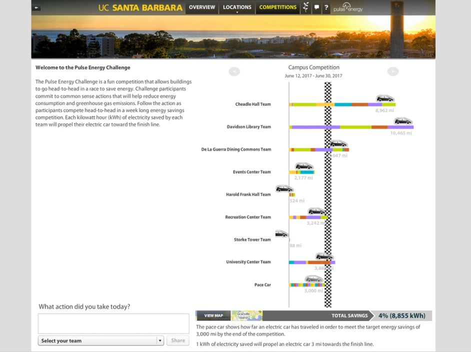
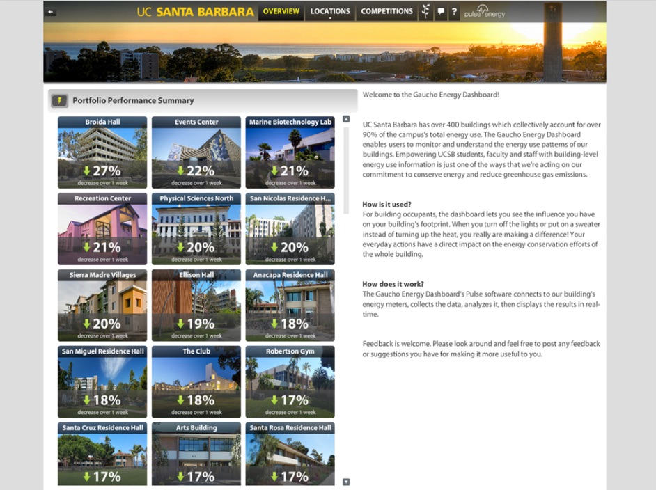
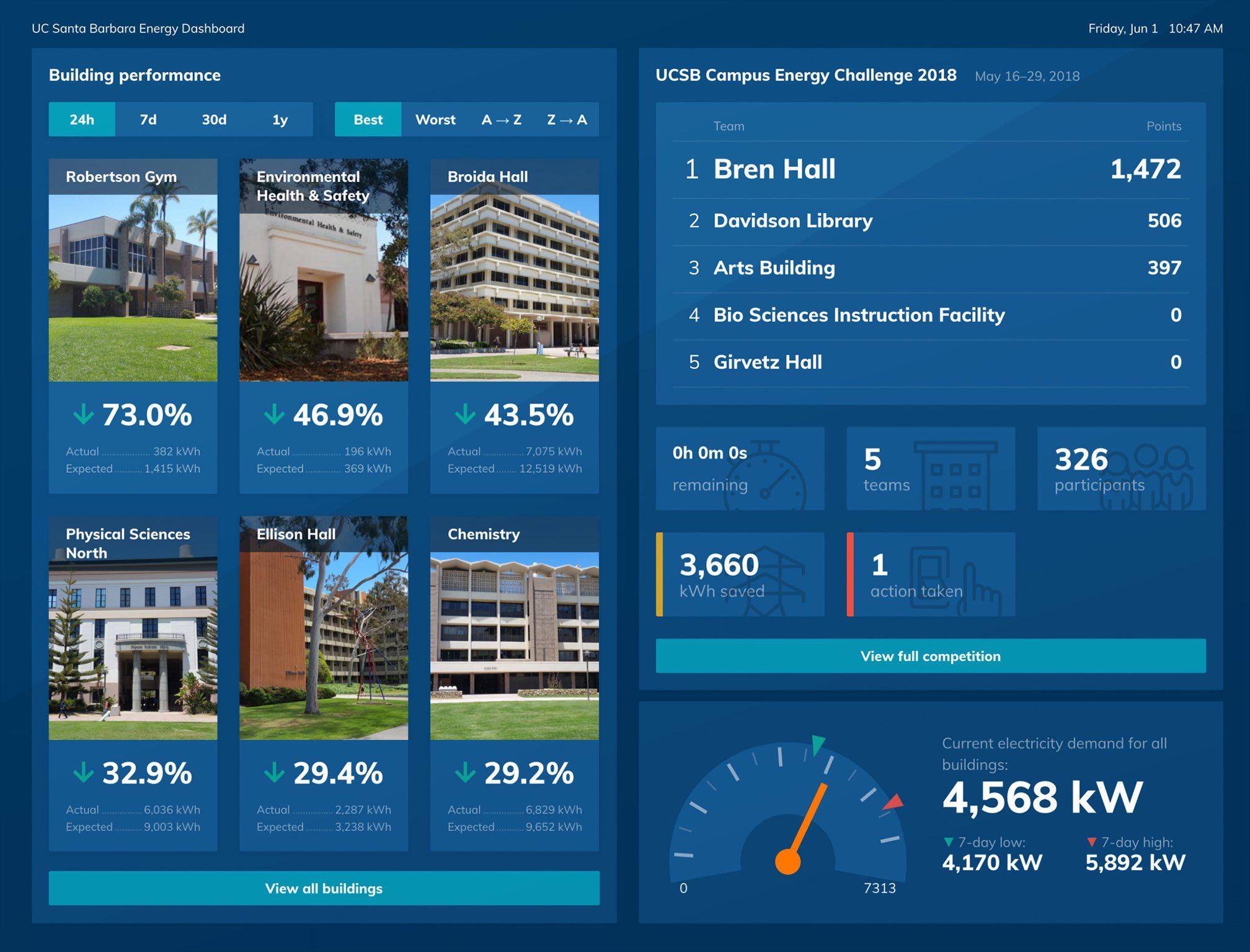
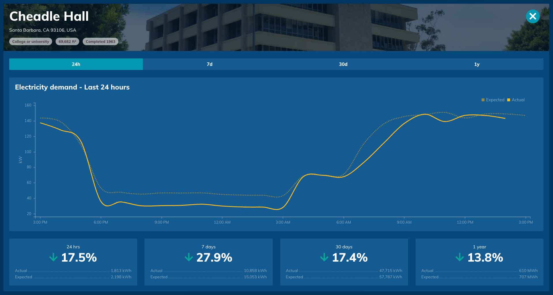
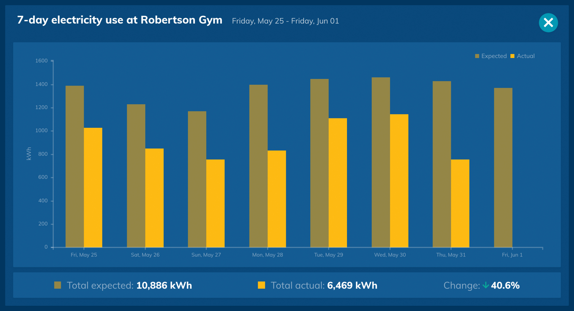
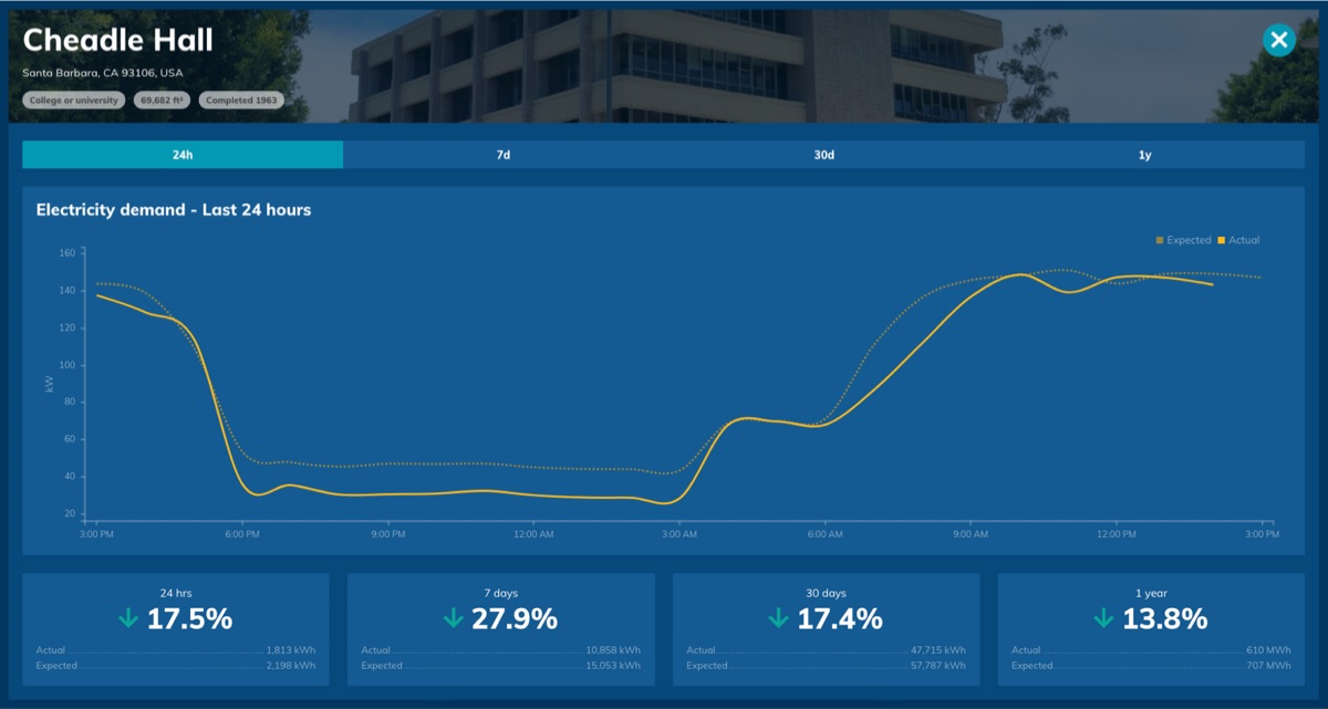
OED branded for UC Santa Barbara
Challenges
What held the legacy dashboard back
A full audit of the original platform and feedback from customers and support staff revealed five core problems:
- →Outdated technology - Flash-based and not compatible with modern devices
- →Text-heavy UI - Overwhelming information density and unclear hierarchy
- →Fixed layouts - No responsiveness or screen adaptation
- →Customization bottlenecks - Changes required direct support from Pulse
- →Participation barriers - Students had to create accounts to take part
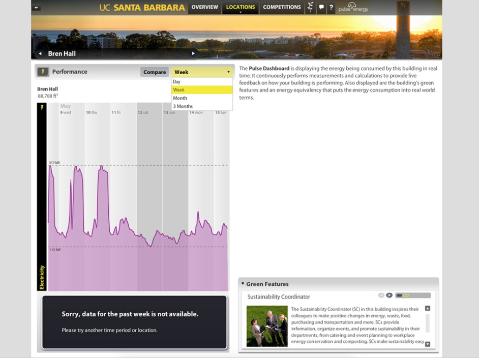
Legacy dashboard
The original engagement dashboard was built using Flash. It was text-heavy, did not always use screen real estate effectively, and was largely non-interactive.
User outreach
In-person discussion reveals far more than an email
Through on-site workshops with energy managers, professors, and students, we learned that our data structures didn't reflect how users thought about their campuses.
Workshops and user feedback sessions
On-site visits allowed for a more personal connection with users
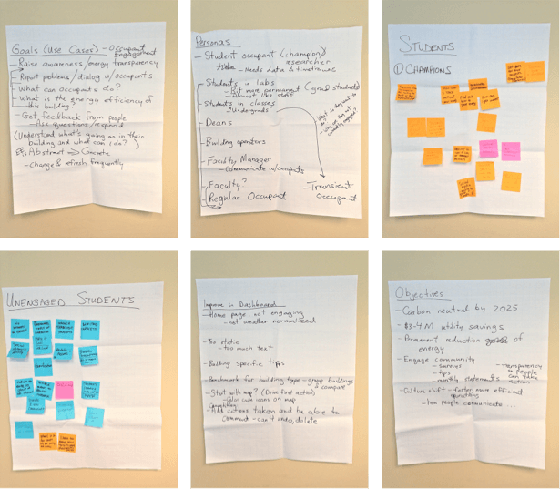
Aligning the platform with users' mental models helped non-technical users configure and operate dashboards easily.
Design foundations
From mental models to modular wireframes
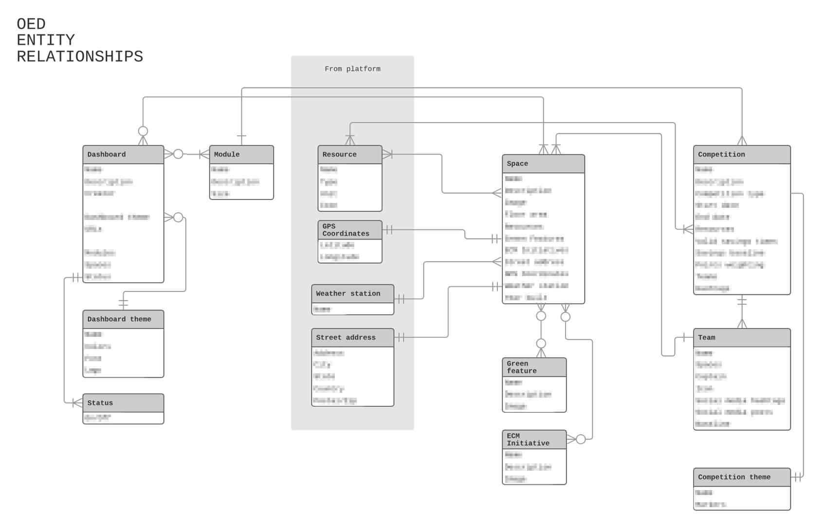
Early design efforts focused on aligning the platform with users' expectations and constraints. Based on workshops and field visits, we created Entity Relationship Diagrams (ERDs) to reflect how users conceptualized buildings, floors, meters, and zones—highlighting gaps between the underlying data model and real-world mental models.
Entity Relationship Diagram (ERD)
Visualizing data to establish a shared understanding
Since the dashboard functioned as a CMS for unscrollable, kiosk-based layouts, we prioritized modularity. Each component needed to adapt to available space while maintaining clarity and hierarchy.
- →Mapped user mental models through ERDs to inform data structure and layout logic
- →Designed flexible modules for variable, non-scrollable kiosk displays
- →Avoid bike-shedding by limiting fidelity in early stages
We deliberately avoided high-fidelity mockups in early testing—using monochrome palettes and monospace fonts to encourage feedback on structure and utility rather than styling.
Low-fidelity wireframes
Presenting lo-fi layouts during early customer feedback sessions helped keep the focus on architecture, workflows, functionality, etc. and avoided discussing aesthetics.
Participation
Lowering barriers and boosting engagement
One of our key goals was to make energy competitions easier to participate in, especially for students:
- →No logins or accounts required
- →Anonymous and team-based competition modes supported
- →Professors could launch competitions from a simple UI
- →Real-time data visualized collective impact and rankings
By eliminating friction, we helped turn awareness into active participation.
Results
Deployment, outcomes, and long-term impact
- ✓Deployed across UC campuses including Berkeley and Santa Barbara
- ✓Used in sustainability-focused curricula and student challenges
- ✓Dramatically reduced support burden with self-serve tooling
- ✓Reinforced Pulse Energy's leadership in public energy engagement
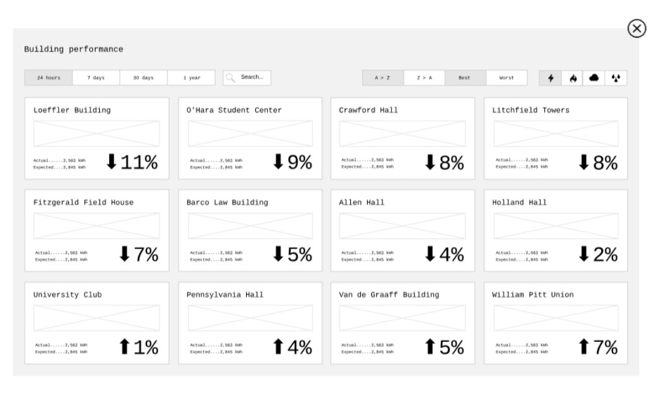
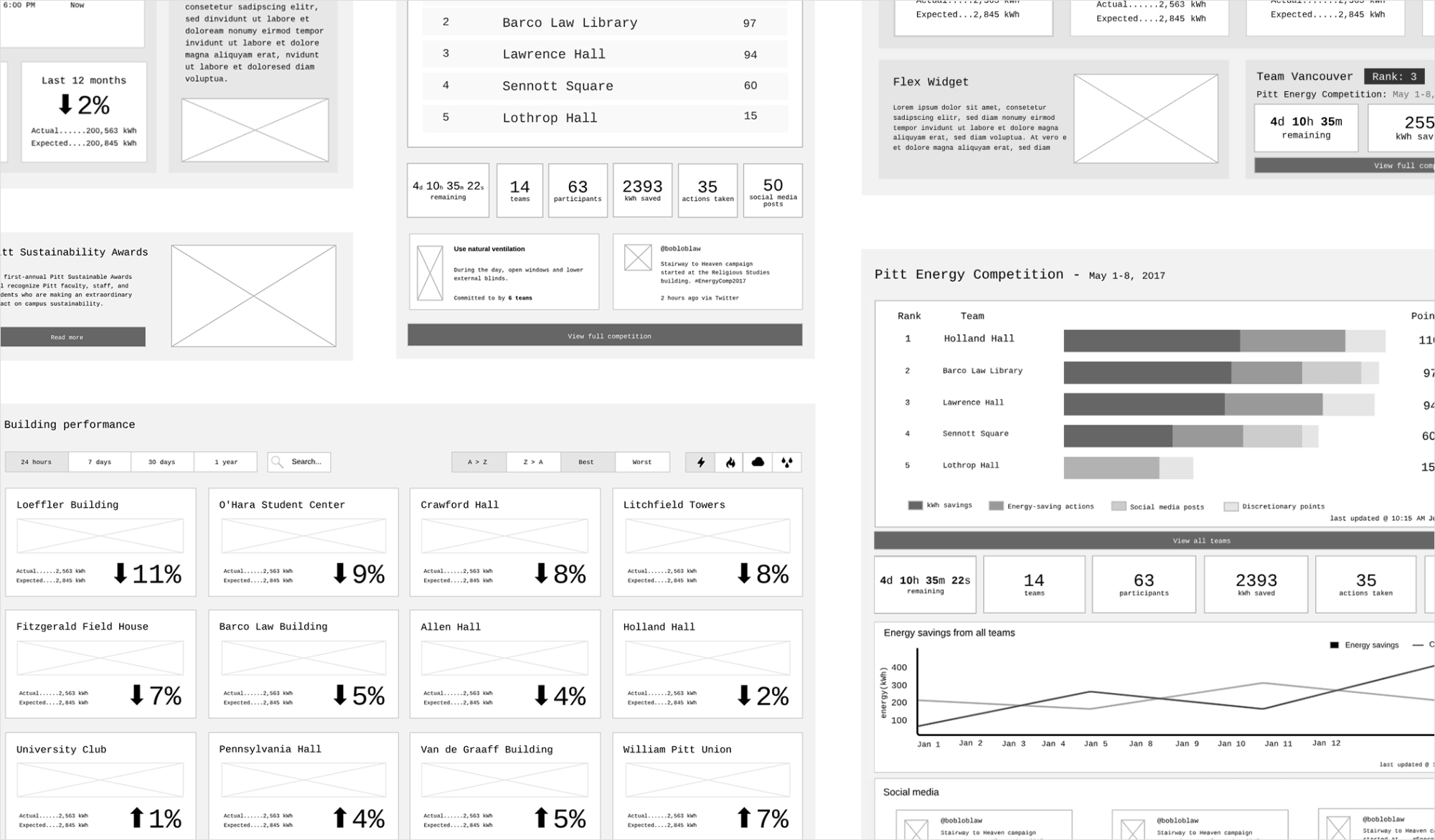
Galleries
Images of the Pulse Energy Engagement Dashboard (v1)
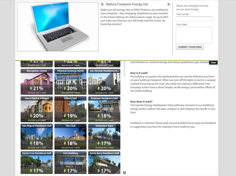
Dashboard images
OED images branded for UC Santa Barbara
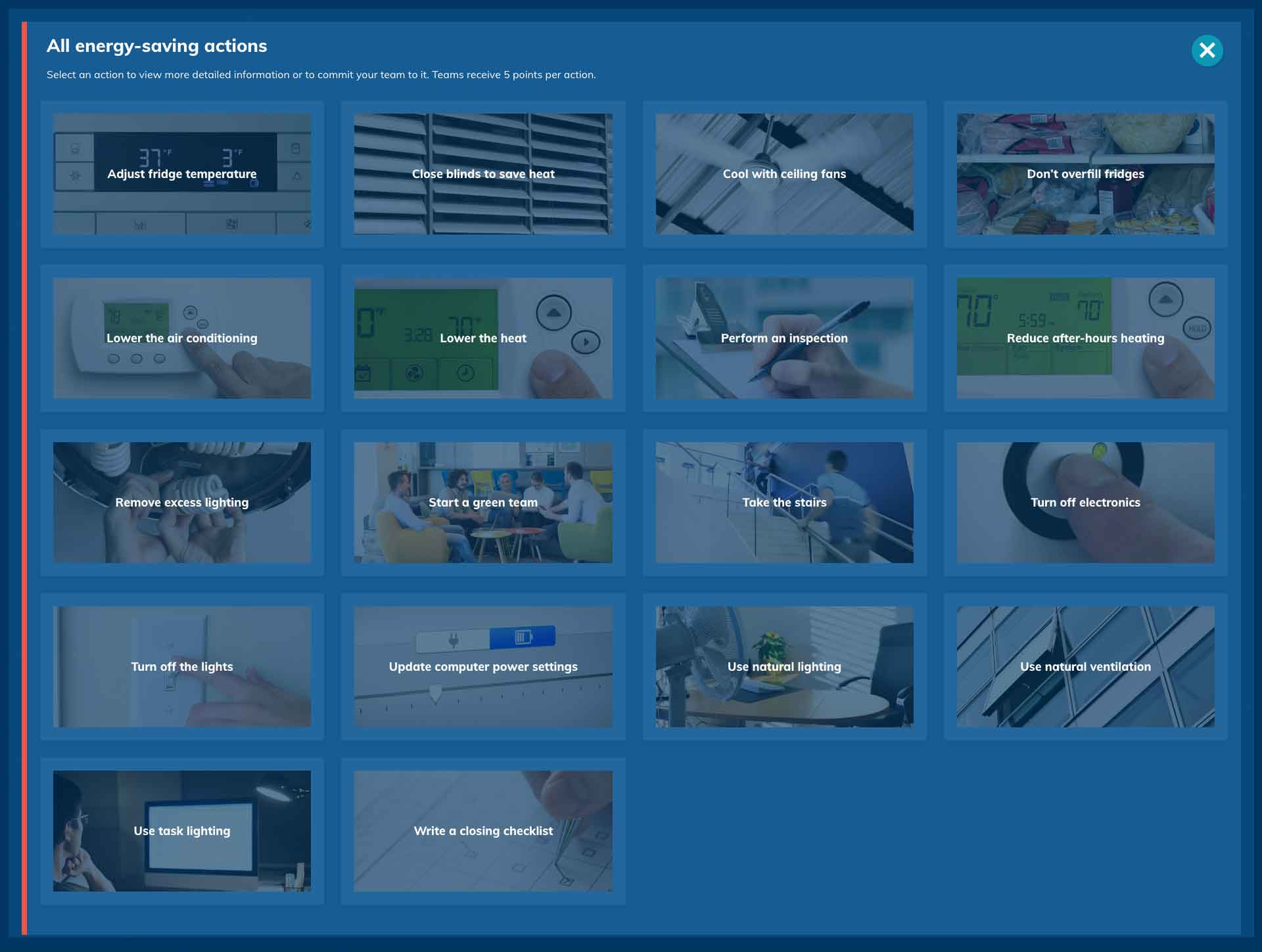
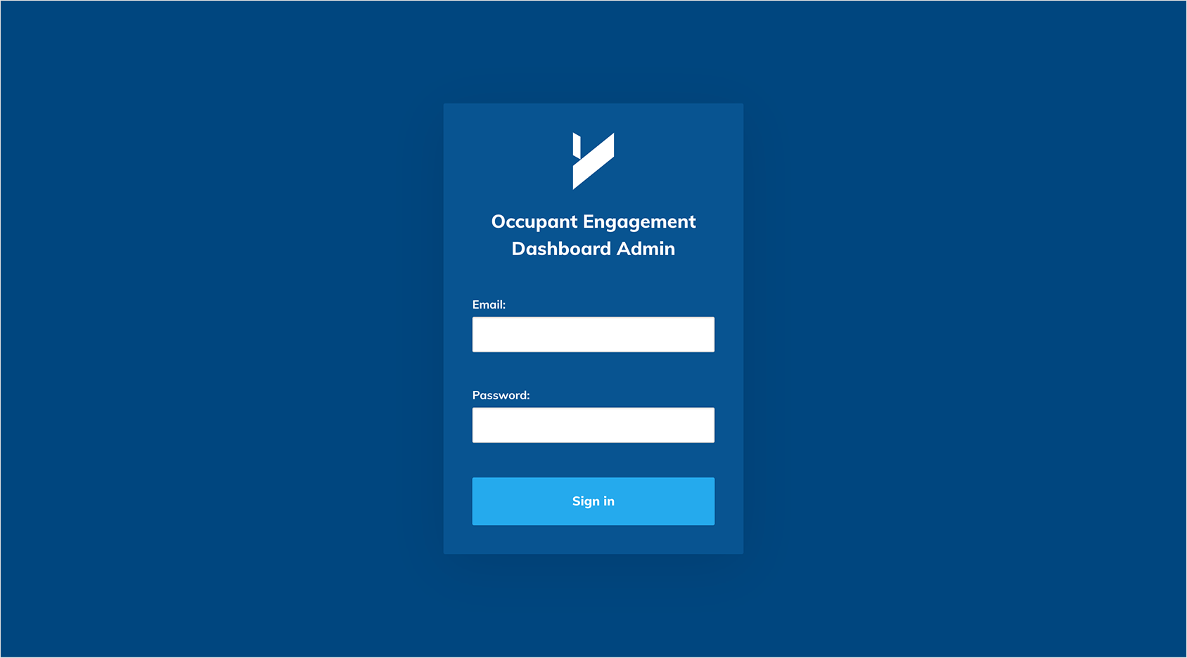
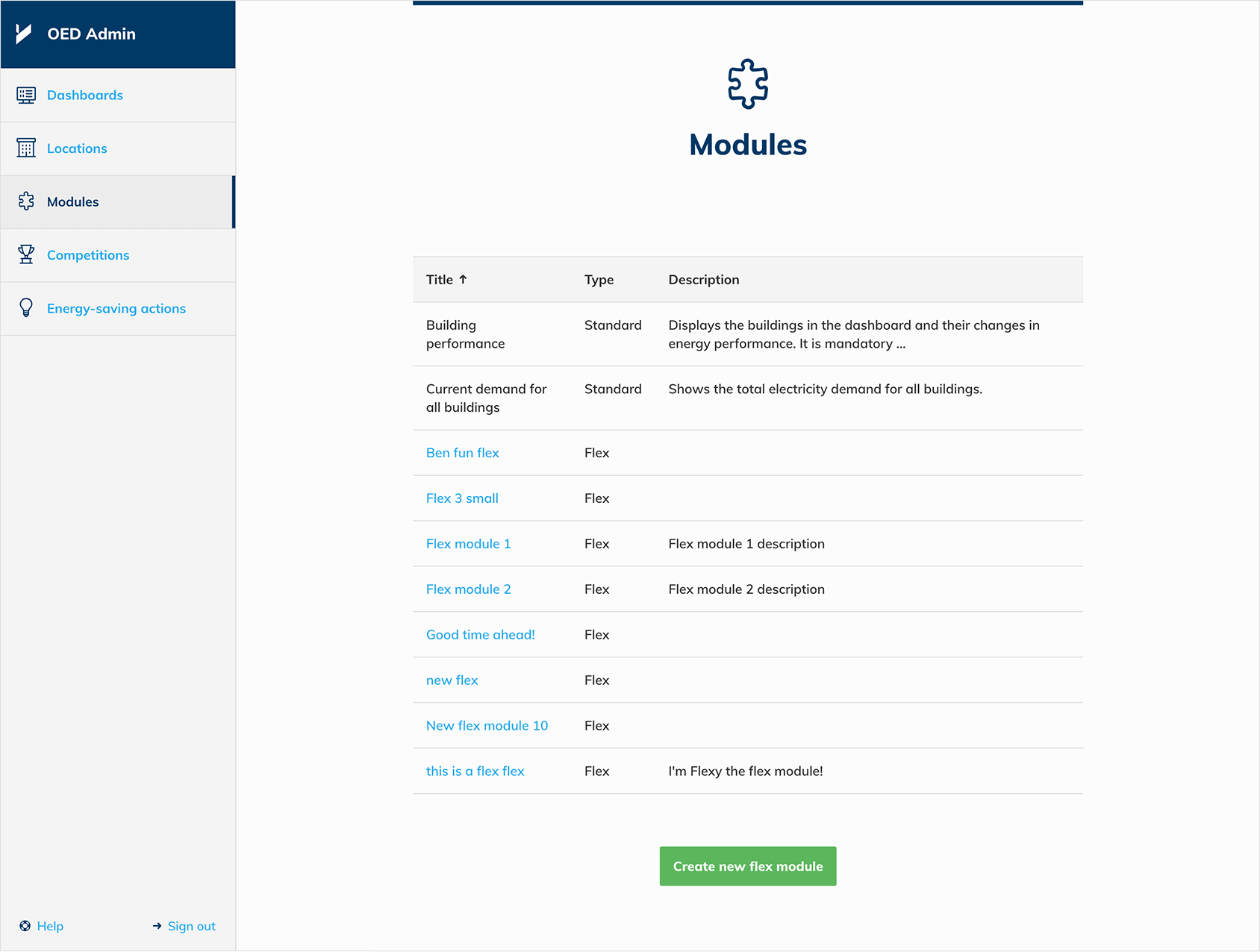
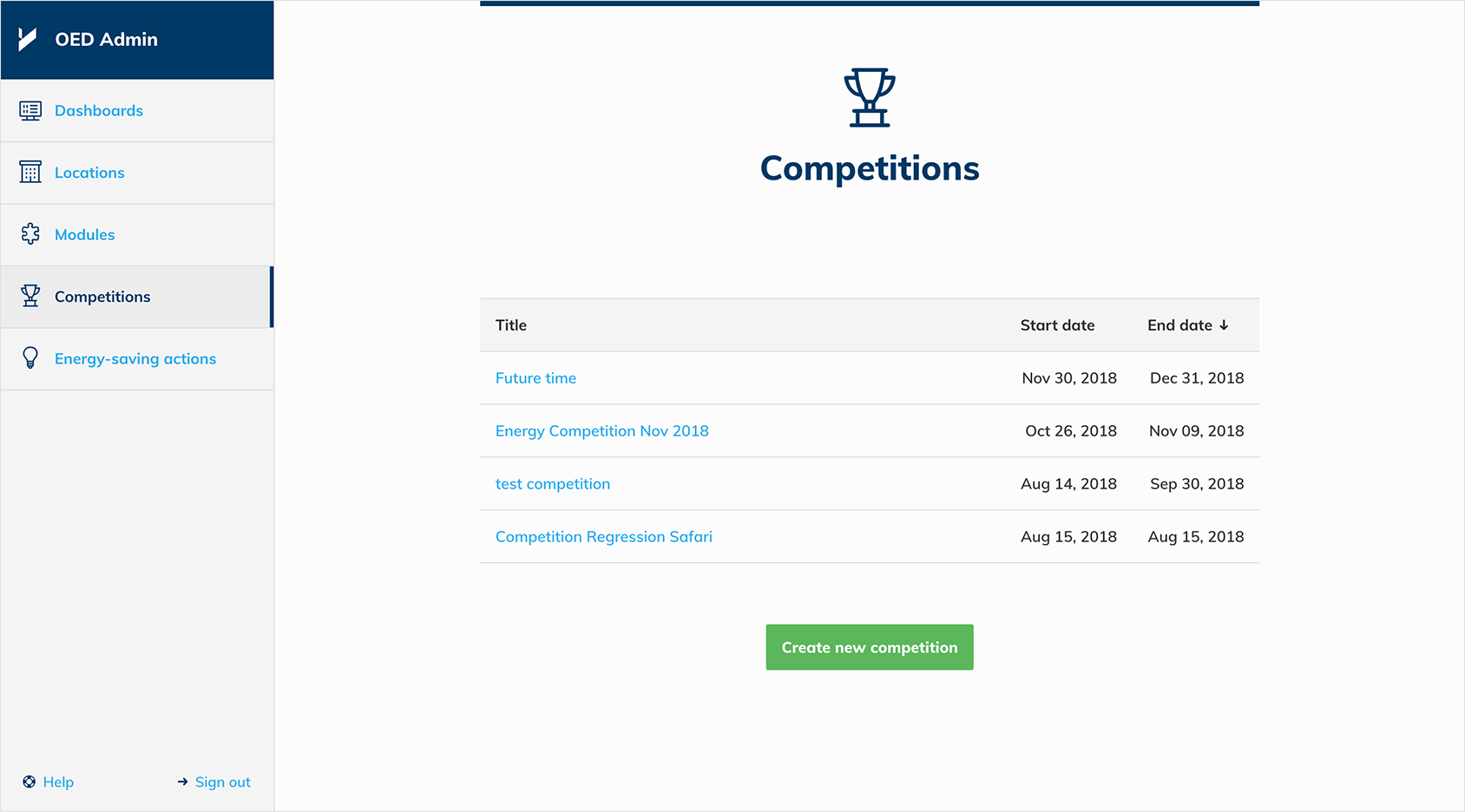
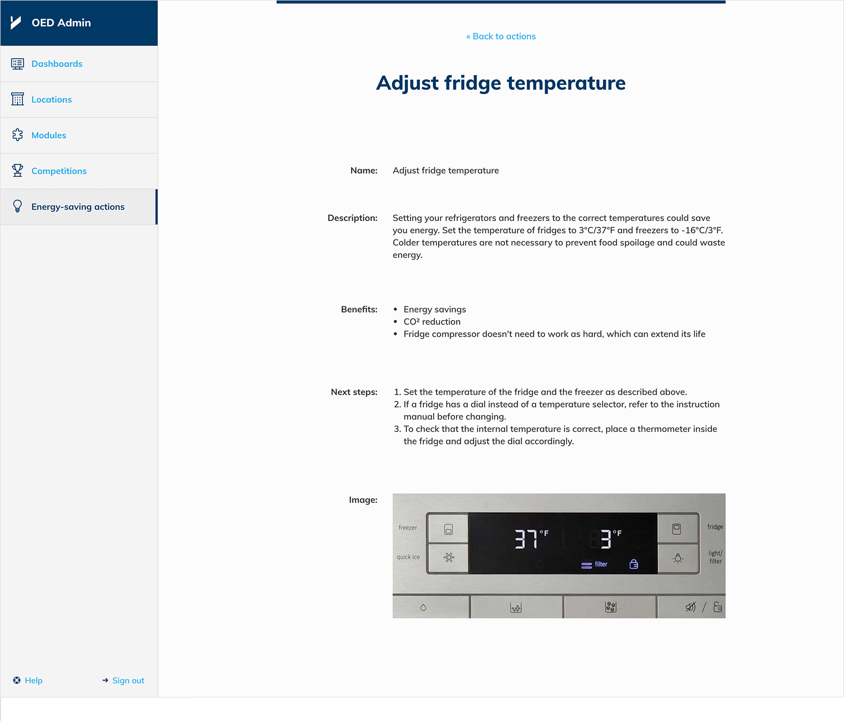
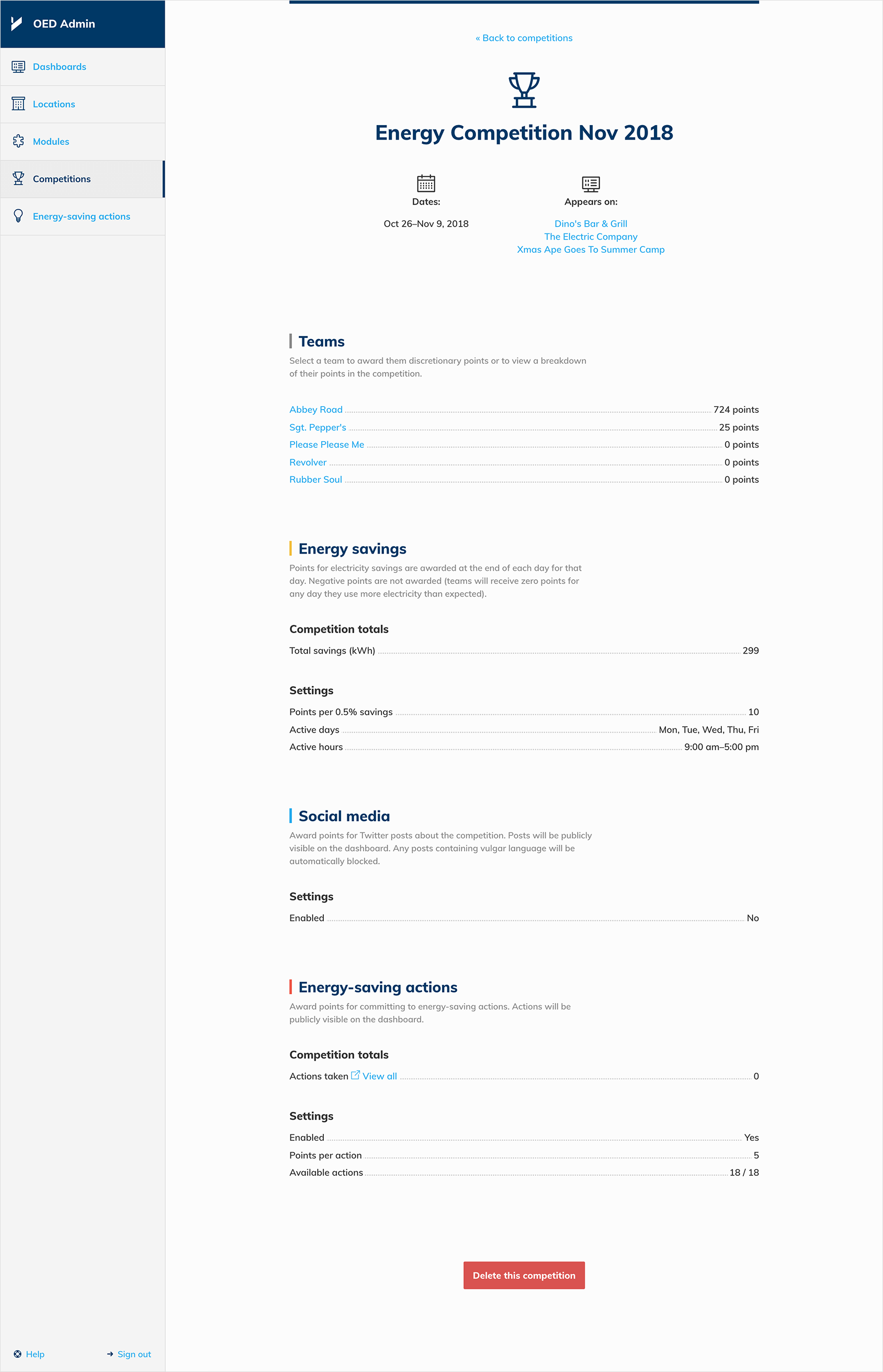
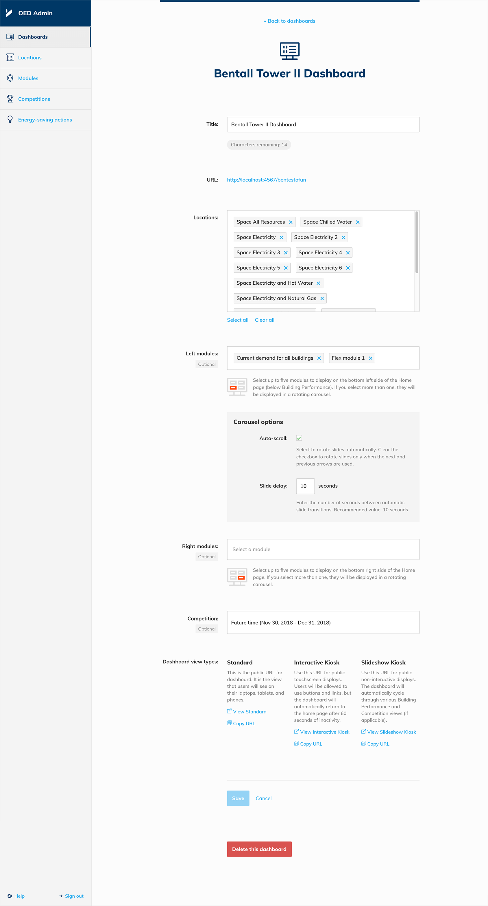
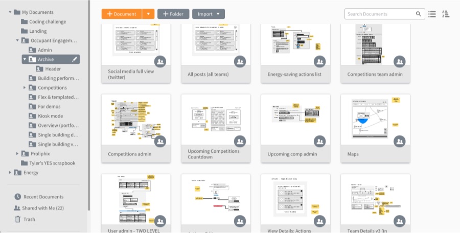
OED Admin tool
A lightweight admin tool allowed users to build custom dashboards and create/run energy competitions. It also gave users complete control over the management of energy competitions. Custom dashboard branding was also consistent in the admin app.